Are you interested in creating stunning minimal graphic designs? Look no further! In this video by Satori Graphics, you’ll learn five golden rules for producing quality minimalistic designs. The video covers various aspects, including the use of imagery, font selection, color choices, and achieving balance in your designs. By the end of the video, you’ll not only be equipped with valuable tips but also have the opportunity to test your knowledge. So, if you’re passionate about minimalistic design or want to enhance your graphic design skills, this tutorial is perfect for you. Design your future today and unlock the secrets of minimal graphic design with these pro-tips!
Minimal graphic design is a fascinating field that captivates many with its refined and visually appealing aesthetics. If you’re eager to dive into the world of minimalism, then this tutorial is for you. By following the five golden rules shared in the video, you’ll learn the techniques necessary to create stunning minimalistic designs. From using imagery effectively to selecting the right fonts and colors, each aspect is covered in detail. So why wait? Tune in, learn, and test your knowledge to become a pro at minimal graphic design. Design your future today and let your creativity shine!
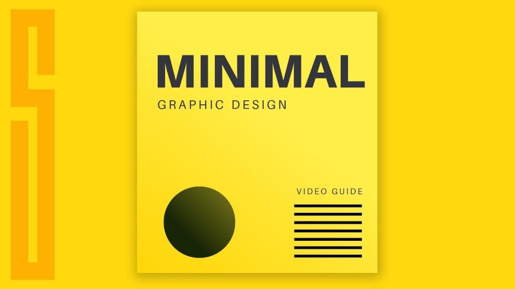
Table of Contents
Pro-Tips for Creating Minimal Graphic Designs
Minimal graphic design is a popular and interesting sector of creative design. It’s an art form that requires techniques and rules to create effective and visually appealing designs. In this article, we will explore five pro-tips for creating minimal graphic designs. These tips will cover the use of imagery content, font selection, color choice, cleaning out unnecessary elements, and creating balance. By following these tips, you will be able to create high-quality, minimalist designs that capture attention and interest.
Use of Imagery Content
When creating minimal graphic designs, it’s important to consider the use of imagery content. While minimal design often focuses on wide-open spaces, the strategic use of imagery can be highly effective. Imagery can act as a focal point or balance in your design, whether symmetrical or asymmetrical.
For example, you can use a model as a focal point for typography, creating a sense of balance with other elements. You can also experiment with placing imagery in the background or using it with low opacity or blend modes. This can add depth and interest to your design. When selecting imagery, look for photos that feel simple and easygoing, and experiment with different placements and effects.
Font Selection
Font selection is crucial in minimal graphic design, as clean and readable typography is essential for effective designs. To create a cohesive and harmonious design, you should develop font palettes with one or two font families.
Creating hierarchy with font pairing is also important in minimal design. Since there are few design elements competing for attention, contrasting and pairing fonts can create visual interest and emphasize key messages. Don’t be afraid to play with attention-grabbing text, but ensure that it remains legible. Typography can act as a focal point in minimal design if done correctly, so choose your fonts carefully and give them the attention they deserve.
Color Choice
In minimal graphic design, simplicity is key when it comes to color choice. Black on white can be your base colors, but you don’t have to limit yourself to just black and white. Choosing one color to draw the design forward can add depth and meaning, matching the message and theme of your design.
You can also consider using colors as focal points in your design. A bright or light color can serve as a background texture or an accent, highlighting key elements. When using color in minimal design, it’s important to create high contrast. Use colors that are distinctly different and stark when set against each other. This will make your design visually striking and help draw attention to important elements.

Cleaning Out Unnecessary Elements
One of the defining characteristics of minimal design is its focus on the bare essentials. To create a successful minimal graphic design, you need to clean out unnecessary elements and ensure practicality and visual appeal.
Think about each design element individually and ask yourself if it serves a purpose that enhances the user experience. If an element is purely decorative and doesn’t contribute to the overall functionality or message of the design, consider removing it. Minimal design is about refining the design down to its key essentials and using those essentials as attention grabbers.
Creating Balance
Creating balance is crucial in minimal graphic design to prevent the design from feeling lopsided or overwhelming. Balance can be achieved by balancing bold or heavy elements with shape, space, or light elements.
For example, in a design with a bold or heavy image, you can balance it by incorporating lighter elements in the form of shapes or negative space. This will create harmony and ensure that no single element dominates the design. Pay attention to the placement and arrangement of your design elements to establish balance and create a visually pleasing composition.
In conclusion, creating high-quality minimal graphic designs requires attention to detail and adherence to certain pro-tips. By considering the use of imagery content, font selection, color choice, cleaning out unnecessary elements, and creating balance, you can create visually appealing and effective minimalist designs. So go ahead and apply these pro-tips to your next graphic design project, and watch your minimal designs captivate and engage your audience.


